-
Click on the Dashboard tab of your operator dashbaord.
-
At the top of the page, you will find the following panels:
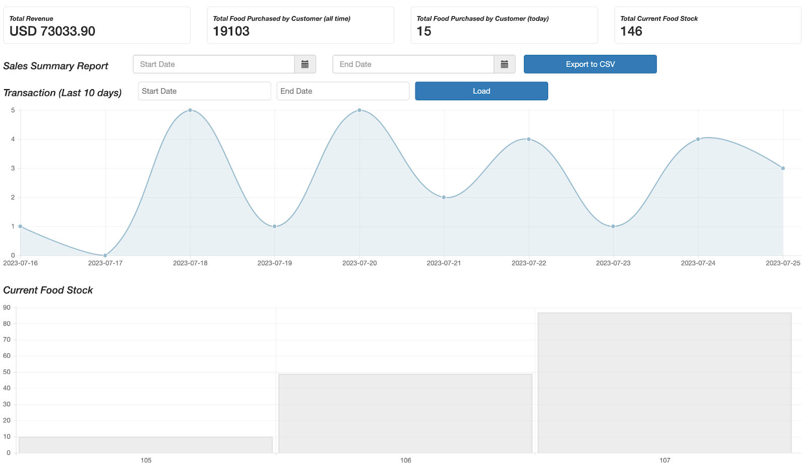
Overview Graphs
Scrolling down to the
-
Transactions - the number of transactions in the last 10 days
-
Current Food Stock - inventory quantity by microstore. Clicking on the shaded gray bars displays real-time inventory list for that given microstore.
Detailed Reports
Scrolling down the page, you find deeper insights in a gray box. Start by filtering by microstore and selecting the date range in the Filters panel. Graphs in this section can be re-arranged – just drag and drop to your liking.
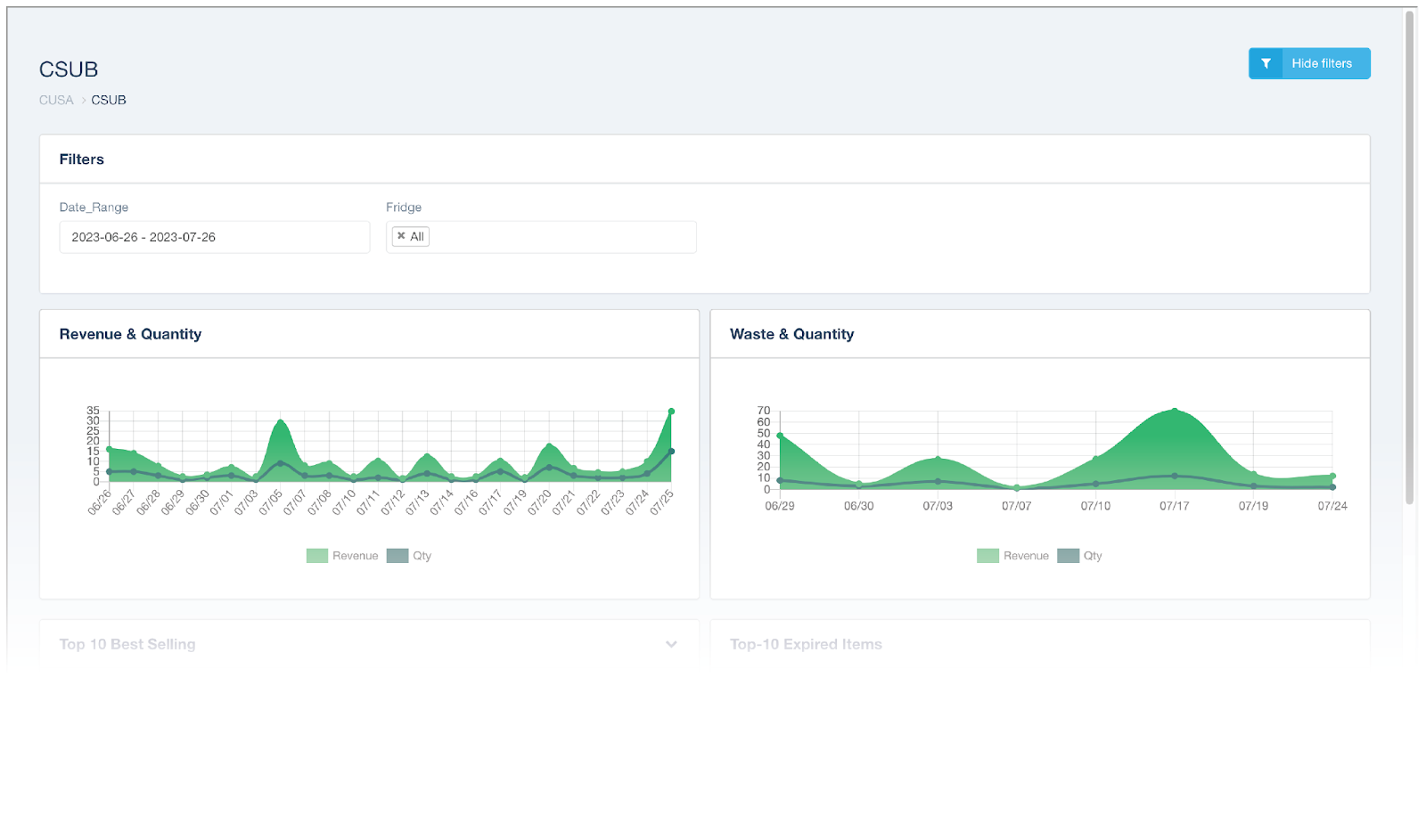
- Revenue & Quantity - revenue and quantity of items sold by day
- Waste & Quantity - how many items were removed by your staff, along with their total dollar value. Note that these items have not necessarily expired, but were only removed (not sold).
- Top 10 Best Selling - top 10 best-selling items in the selected time period
- Top 10 Expired Items - top 10 most removed items in the selected time period. Note that these items have not necessarily expired, but were only removed (not sold).
- Location Performance - total sales and quantity of products sold per microstore in the given period
- Location Waste - total dollar amount and quantity of products wasted in the given period
- Transaction Report - Report of every individual product sold, grouped by transaction
- Inventory Analysis - the average time it took for items to sell during the selected time period
- Sales Quantity by Type - pie chart showing a breakdown of each type of item sold. Types of products include Food, Drinks, Snacks, and Miscellaneous.
- Basket Size - pie chart showing a breakdown of the basket sizes (# of items bought in a single transaction)
- Transaction Type - pie chart showing a breakdown of payment methods used to purchase
- Credit Card Type - pie chart showing a breakdown of credit card providers used to purchase
- Sales Density by Hour-of-Day - a chart showing how many of each product Type was sold in a given hour of the day
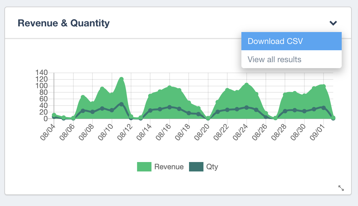
Exporting Data
To export data for any of these data, simply click on the down arrow on the top right corner of the desired graph and select “Download CSV.” For example, a revenue report can be exported like so:
Keywords: what does this chart mean?, what do all the graphs mean on my dashboard